Page MenuHomePhabricator

Watchlist Expiry: Fix alignment of dropdown options for Minerva
Closed, ResolvedPublic2 Estimated Story Points

Description

As a Watchlist Expiry user, I want the dropdown options to be left-aligned, so they do not have an unappealing or awkward appearance.

Acceptance Criteria:

  • For Minerva users, when they are in the mobile view, the watch period options in the dropdown should be left-aligned

Screenshot example:

Screen Shot 2020-09-03 at 4.51.03 PM.png (269×823 px, 51 KB)

Event Timeline

Pinging @Prtksxna to get recommendations on this ticket

ifried renamed this task from Watchlist Expiry: UX improvements for dropdown (mobile) [placeholder] to Watchlist Expiry: Fix alignment of dropdown options for Minerva (mobile).Sep 3 2020, 10:53 PM
ifried updated the task description. (Show Details)

This is what I see on mobile at the moment:

Screenshot 2020-09-07 at 8.49.16 AM.png (412×718 px, 89 KB)
Screenshot 2020-09-07 at 8.48.12 AM.png (369×725 px, 57 KB)

I see two options here:

  • Make the whole thing left aligned like the popup on desktop (note: I am only talking about the watchlist popup, not all popups that use this style)
  • Keep the main message center aligned and make the Watchlist time period: label and the dropdown labels left aligned.

@ifried, do we also have control over the look of the dropdown? I noticed that it is looking different for both of us.

ifried renamed this task from Watchlist Expiry: Fix alignment of dropdown options for Minerva (mobile) to Watchlist Expiry: Fix alignment of dropdown options for Minerva .Sep 8 2020, 6:48 PM

@Prtksxna My mistake! The issue shows up on desktop; not mobile. Let me know if you see the same behavior when you test desktop Minerva.

ARamirez_WMF set the point value for this task to 2.Sep 10 2020, 5:36 PM
ARamirez_WMF moved this task from Needs Discussion to Up Next (June 3-21) on the Community-Tech board.

Note also the dropdown itself either needs to be full-width or centered.

Screenshot from 2020-09-16 11-14-22.png (287×1 px, 78 KB)

Okay, thanks, @MusikAnimal!

In that case, pinging @Prtksxna: Do you recommend that we have the dropdown be centered or full-width? I know we previously discussed that the dropdown should be left-aligned, but do you still feel it should be left-aligned if it is full-width? Thanks!

Note also the dropdown itself either needs to be full-width or centered.

In that case the it's better that everything be centered instead. Like F32248167.

Samwilson subscribed.

It looks like there's a difference in how Firefox and Chrome handle alignment within the dropdown. Should it be aligned left, or centred?

Change 628633 had a related patch set uploaded (by Samwilson; owner: Samwilson):
[mediawiki/skins/MinervaNeue@master] Center align the expiry dropdown in watchstar widget

https://gerrit.wikimedia.org/r/628633

It looks like there's a difference in how Firefox and Chrome handle alignment within the dropdown. Should it be aligned left, or centred?

Sorry, ignore me, I can actually read now. :-)

Change 628633 merged by jenkins-bot:
[mediawiki/skins/MinervaNeue@master] Center and align the expiry dropdown in watchstar widget

https://gerrit.wikimedia.org/r/628633

Change 628986 had a related patch set uploaded (by Samwilson; owner: Samwilson):
[mediawiki/skins/MinervaNeue@REL1_35] Center and align the expiry dropdown in watchstar widget

https://gerrit.wikimedia.org/r/628986

Change 628986 merged by jenkins-bot:
[mediawiki/skins/MinervaNeue@REL1_35] Center and align the expiry dropdown in watchstar widget

https://gerrit.wikimedia.org/r/628986

dom_walden subscribed.

Before this change:

Dropdown closedDropdown open
minerva_alignment_before.png (146×1 px, 12 KB)
minerva_alignment_before_open.png (240×1 px, 15 KB)

After this change:

Dropdown closedDropdown open
minerva_alignment_after.png (137×1 px, 12 KB)
minerva_alignment_after_open.png (248×1 px, 9 KB)

I tested it on a couple of mobile emulators (iPhone and Android). There isn't any noticeable difference when the viewport is narrow.

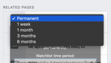
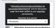
These changes have now been deployed. I have tested on frwiki (with Minerva skin) and the dropdown now has the options aligned (see screenshot example below). I'm marking this as Done.

Screen Shot 2020-10-14 at 10.49.33 AM.png (406×1 px, 79 KB)

pFad - Phonifier reborn

Pfad - The Proxy pFad of © 2024 Garber Painting. All rights reserved.

Note: This service is not intended for secure transactions such as banking, social media, email, or purchasing. Use at your own risk. We assume no liability whatsoever for broken pages.


Alternative Proxies:

Alternative Proxy

pFad Proxy

pFad v3 Proxy

pFad v4 Proxy